
Network theory, also commonly referred to as graph theory, uses graphs to represent relations between distinct objects, whether those be people, neurons, companies, or even abstract concepts. Due to its versatility, network theory can be applied to a variety of fields such as sociology, neuroscience, operations research, and public health, and offers an efficient way for researchers to visualize and analyze all the connections among one’s objects of interest.
As part of the John Addington Symonds Project, I have been working with one of my peers, Kendra Brewer, on building a network of people surrounding John Addington Symonds. We used The Memoirs to compile a list of people who had an impact on Symonds’s life, both directly and indirectly. We included the people that he interacted with in real life, but we also included those who he never met but who still inspired him and influenced his work, such as authors, ancient philosophers, and mythological figures.
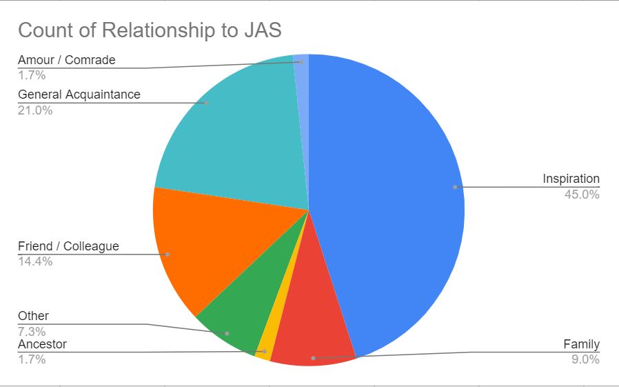
We grouped the people based on their relationships with Symonds, using the categories “Family,” “Ancestor,” “Friend / Colleague,” “Amour / Comrade,” “The Stranger,” “General Acquaintance,” “Inspiration,” and “Other.” “Family” includes relatives of Symonds by blood or marriage with whom Symonds had in-person contact, “Ancestor” includes relatives of Symonds who were dead before his time, “Friend / Colleague” includes people that Symonds was close to, “Amour / Comrade” includes people who had a romantic and/or sexual relationship with Symonds, “The Stranger” includes people with whom Symonds did not have a romantic or sexual relationship but about whom he fantasized, “Inspiration” includes those whose work inspired Symonds, and the “Other” category includes anyone who did not fit into any of the above-mentioned categories. The following figure depicts a breakdown of the different groups shown in the data we collected from The Memoirs.
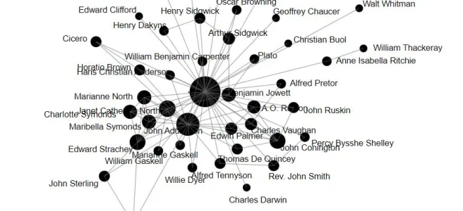
In basic network theory, a graph is defined as a collection of nodes and edges, where an edge represents a connection between two nodes. In this case, we defined the nodes as people, and every edge signified the existence of a relationship between people. The original dataset focused mostly on the relationship each person had with Symonds and not necessarily on the relationships they had with each other, so we arbitrarily sub-sampled a few notable figures from The Memoirs and Symonds’s Letters to construct a preliminary graph representation of Symonds’s network. We chose people whose relationships with one another can be clearly inferred from our sources, and we used Palladio [1], a web-based data visualization tool developed by the Humanities + Design Lab at Stanford University.
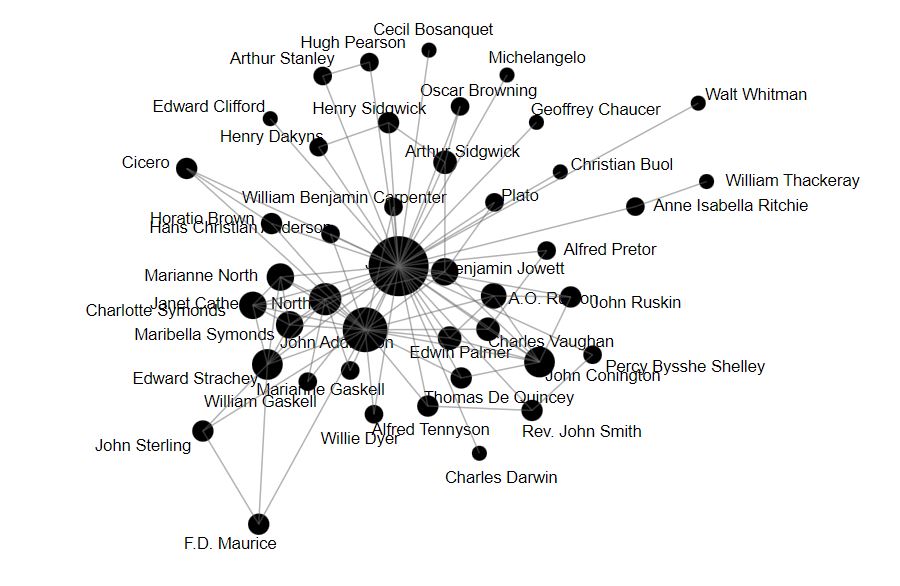
Our sub-sampled graph provides a good partial visualization of Symonds’s network, but there is much room for improvement. Palladio does not allow for much manipulation of network features such as node color, edge color, or edge thickness, which would be a very effective visual aid to the user. The nodes could be colored based on location or profession, the edges could be colored based on the relationship categories as defined above, and edge thickness could represent how close two people were. There are several ways we could quantify closeness, such as the number of mentions in The Memoirs or the number of letters sent between two people. It may be necessary to create a scale with bins, where a certain thickness corresponds to a range of the number of mentions/letters. For example, we could define the transformation such that 10 to 20 mentions correspond to a “closeness” value of 2, 20 to 30 mentions correspond to a “closeness” value of 3, and so on. Thus, it would be interesting to see if we could add any extensions or make any modifications to the program that would allow the user to change various network features as they see fit, making the program more interactive and flexible.
Once we have a more robust graph that can represent a larger dataset effectively, there are several ways we could characterize the network, such as finding the largest connected component, which is defined as the largest subgraph where the nodes are all connected to one another; this component would represent the largest community in which everyone was connected to one another. Or we could find triangle subgraphs in the network, which would tell us if there were any trios that maintained strong communication. We could also try clustering the nodes in the network based on various metrics, to see whether they would cluster differently from their original categories.
There are many creative methods we could use to analyze the network once it has more visually identifiable features as well as more information on not just how the people are related to Symonds but how they are related to each other. The results might act as additional evidence to simply reinforce the knowledge we already have about Symonds’s network or they could shed light on some new connections and communities. I hope future cohorts will be able to build on the basic network that we have created, to unveil novel information from a new, more mathematical perspective.
Works Cited
[1] Stanford University Digital Humanities, “Palladio,” https://digitalhumanities.stanford.edu/palladio.
This is interesting. A couple of points: Figure 1 doesn’t quite sum to 100% yet has no ‘Stranger’ category? Figure 2 is perhaps a distortion due to your accepted arbitrary selection: surprised Symonds other biographical subjects don’t feature and I wonder how Oscar Wilde would ‘fit in.’